
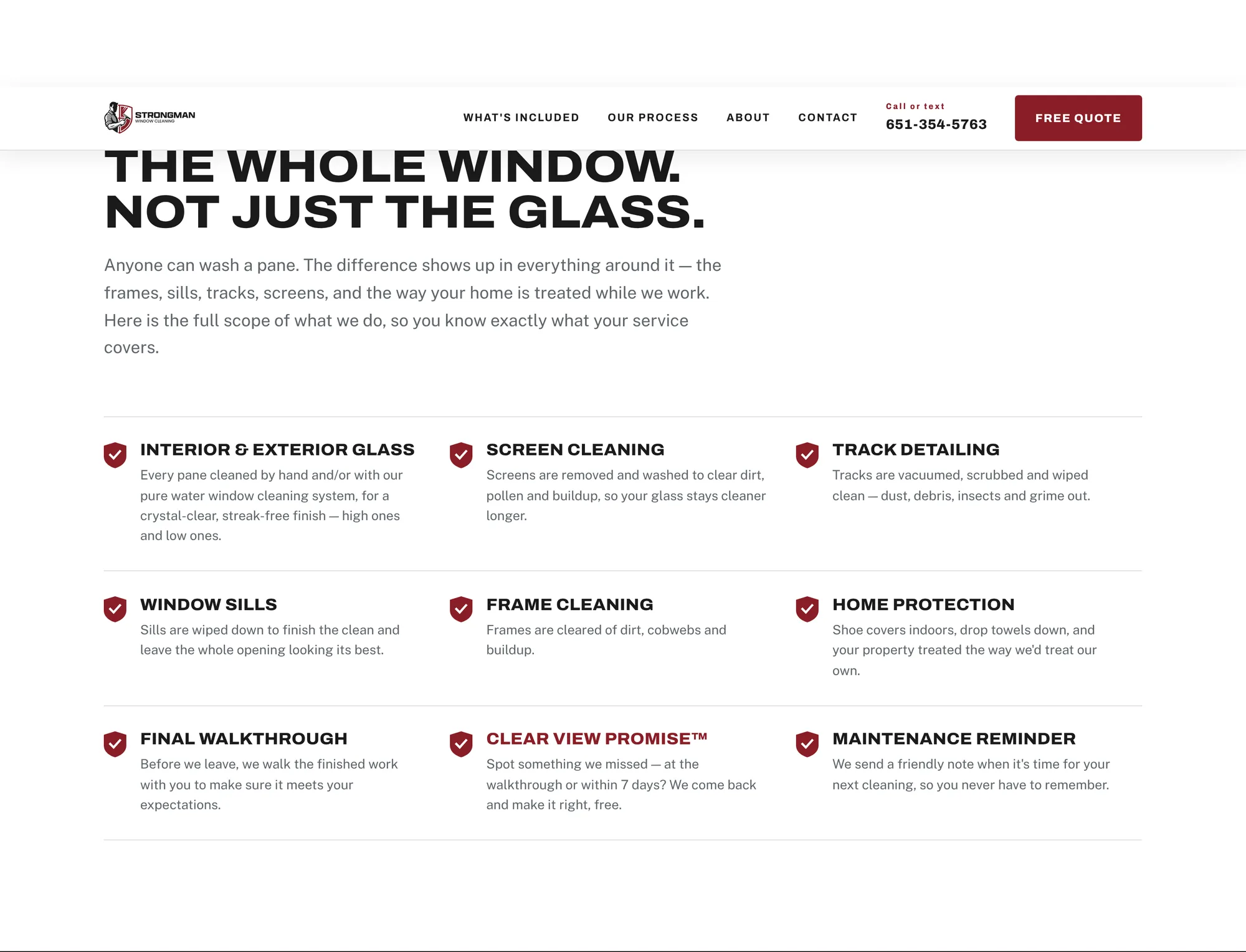
Sell the whole service
Nine line items, from screens and tracks to shoe covers and a final walkthrough, branded as the Strongman Signature Experience. It turns a commodity job into a clear list of what you get.
My name is Jared Lueck. I'm a creative problem solver.
JML is a one-person studio for branding, content and websites. Type-first, built in Adobe, and shaped by a world of street art and hip-hop culture.
Every project starts with the same question: what does this brand need people to feel the first time they see it? Then I build the pieces that make it stick.
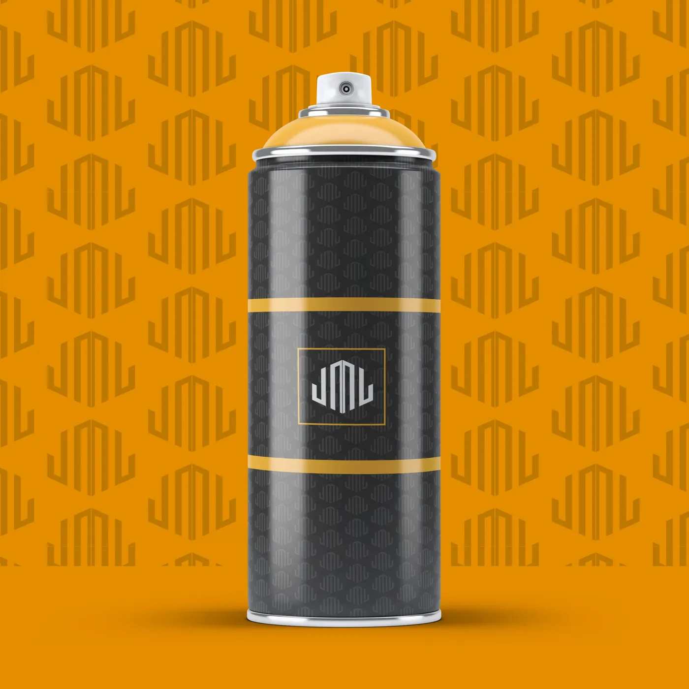
Logos, identity systems, patterns and stationery. A mark that holds up on a business card, a spray can and a storefront.
Posters, social graphics and campaign visuals with type that does the heavy lifting. Built to stop the scroll.
Custom sites for small businesses, designed, built and launched, so the brand looks as sharp online as it does in person.
Case studies, one wall at a time. The brand behind this site first, then the work it's made for.
About Jared
I'm a creative problem solver using Adobe products and my strengths in typography to increase the success of brands. My style comes from a world of street art and hip-hop culture, and I design to leave a mark that lasts, on the street, on the screen, and on every brand I touch.
Walls, tags and wheat-paste. Bold shapes that read from across the street.
Cover art, posters and attitude. Confidence you can feel in a layout.
The strongest tool in the kit. Most of the design happens in the letters.
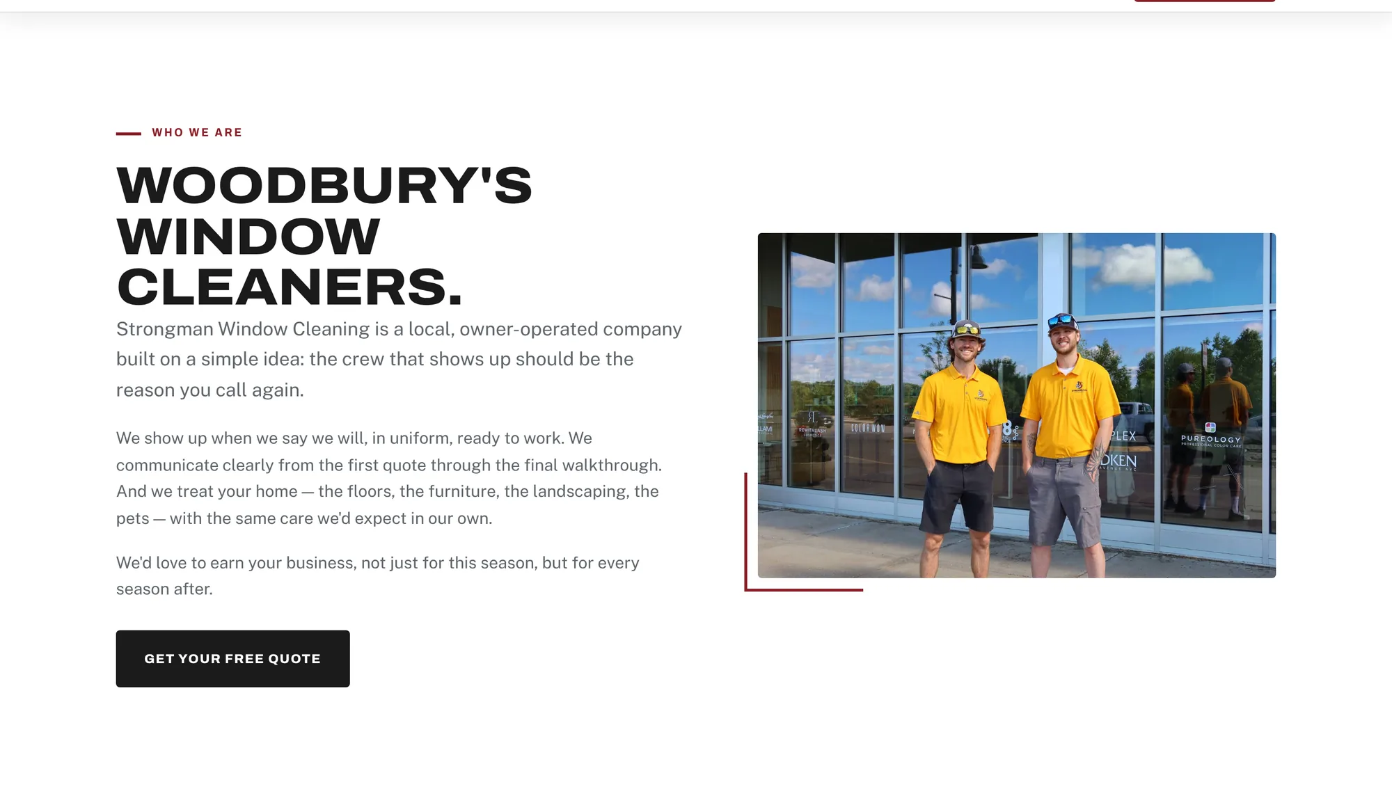
A 2026 brand refresh and custom website for an owner-operated window cleaning crew in Woodbury, Minnesota. One system runs from the logo to yard signs, door hangers and a hand-built site that replaced their Wix template, so the crew looks the same everywhere a homeowner sees them.
A window cleaner mid-squeegee in front of a crimson shield, with the window frame built into the crest. It comes as a stacked lockup, a horizontal lockup, a standalone mark and one-color versions, so it holds up on dark backgrounds, in single-color print and at small sizes. Try it on each background.
 Stacked / full color
The old mark was Strong Man Services: a flexed arm holding a squeegee, in black only. The 2026 identity says exactly what the company does, swaps the arm for a full illustrated window cleaner with the window built into the shield, and adds a crimson and gold color system to carry across everything else.


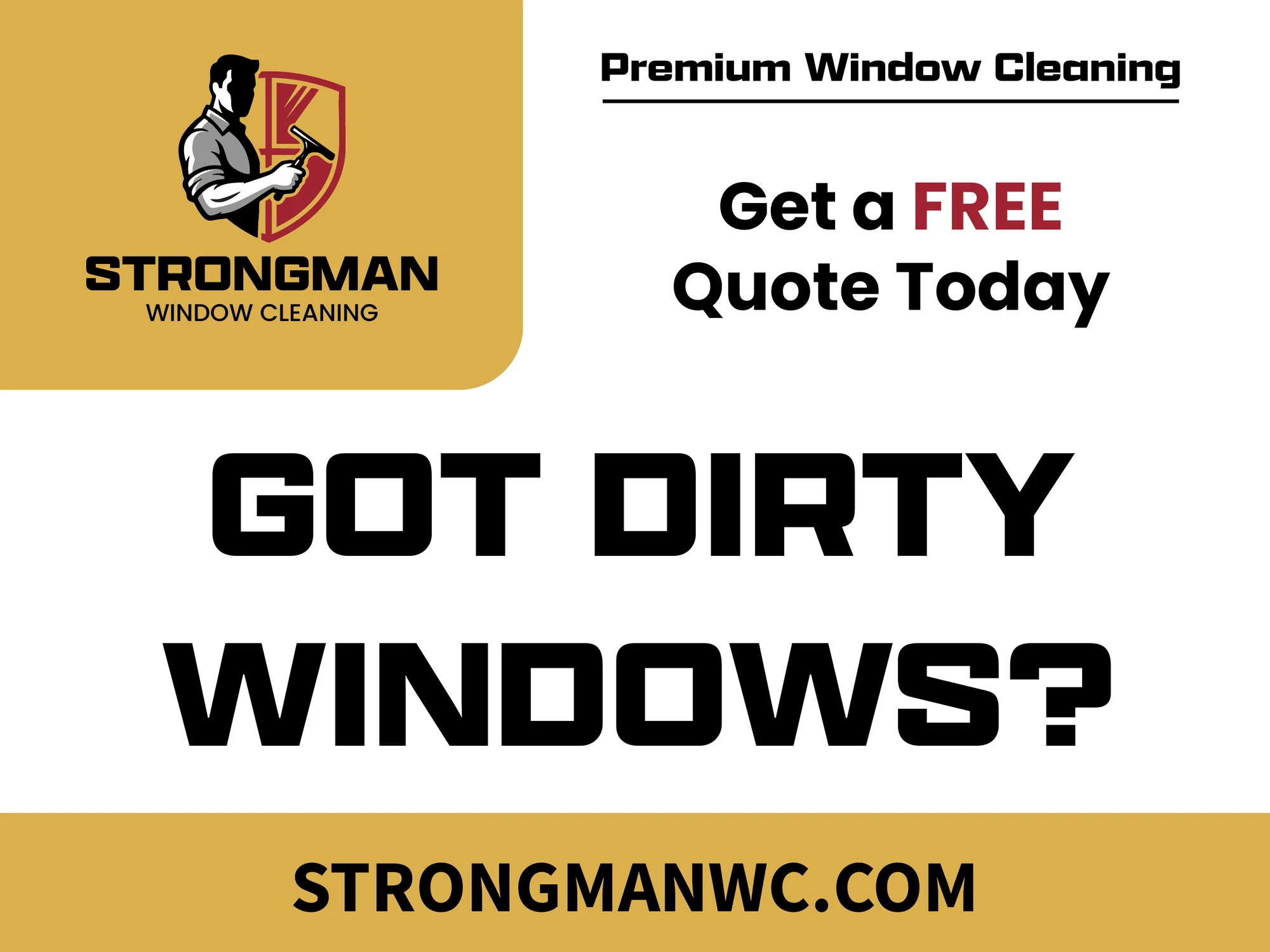
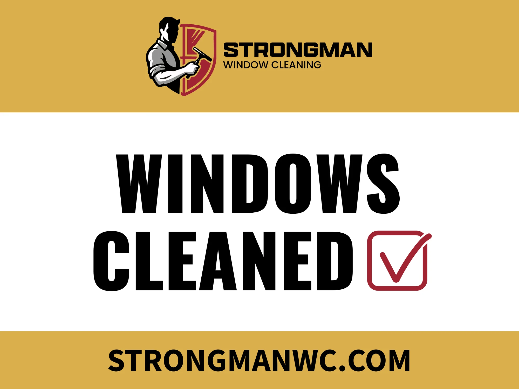
Two messages for two moments. "Got dirty windows?" goes up before the job to start the conversation. "Windows cleaned" goes up after, so the whole street sees the finished work. Huge condensed type, one call to action, and the URL in a band at the bottom.
A real job photo and "Got dirty windows?" on the front. The back lists four reasons to call, the phone number and a QR code to the quote form. Tap the hanger to flip it.

Strongman had a template site that looked like every other window cleaner in the Twin Cities. Prices were hard to compare, so the site had to prove why this crew is worth calling: what's included, how they work, and what happens if something gets missed.
The goal was simple. More free-quote requests from homeowners in Woodbury and the east metro, with a site the owner actually owns, on his own domain.

Scroll inside the window, or hit auto-scroll.
Nine line items, from screens and tracks to shoe covers and a final walkthrough, branded as the Strongman Signature Experience. It turns a commodity job into a clear list of what you get.
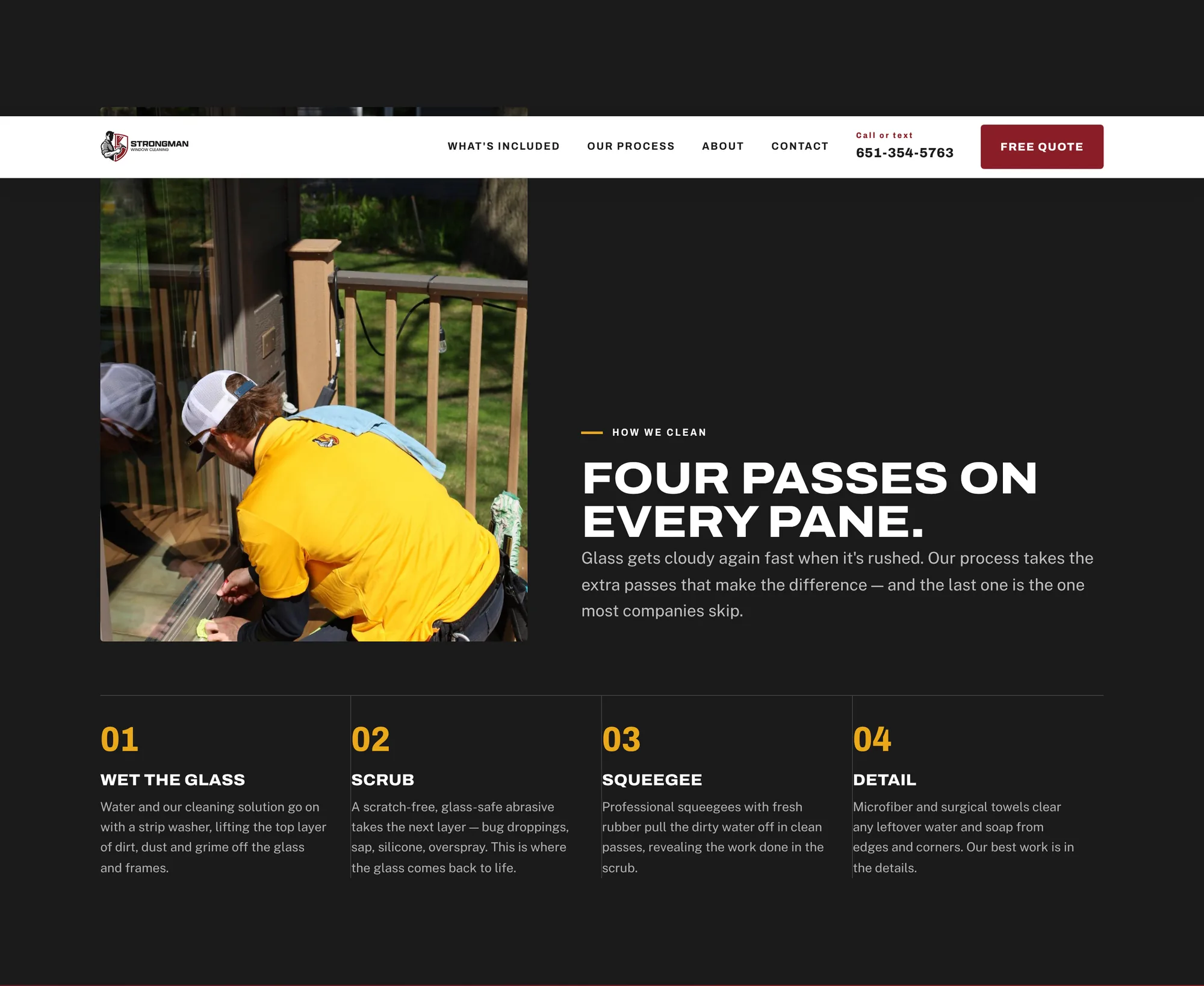
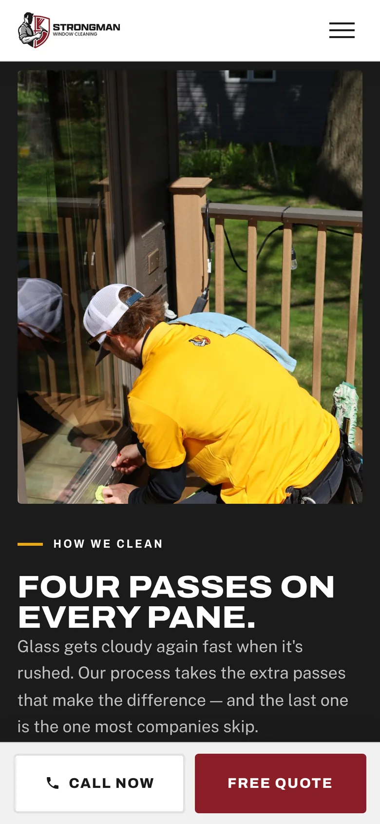
"Four passes on every pane." A dark section with a real crew photo and the four steps in order. It explains why the glass stays clean longer.
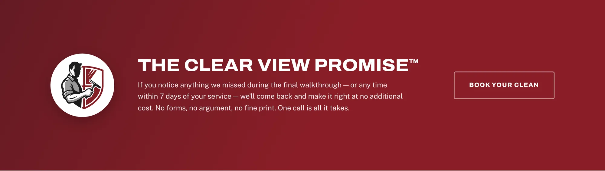
The Clear View Promise gets its own crimson band and its own name. Anything missed within 7 days gets fixed free, and that removes the risk of calling a new company.
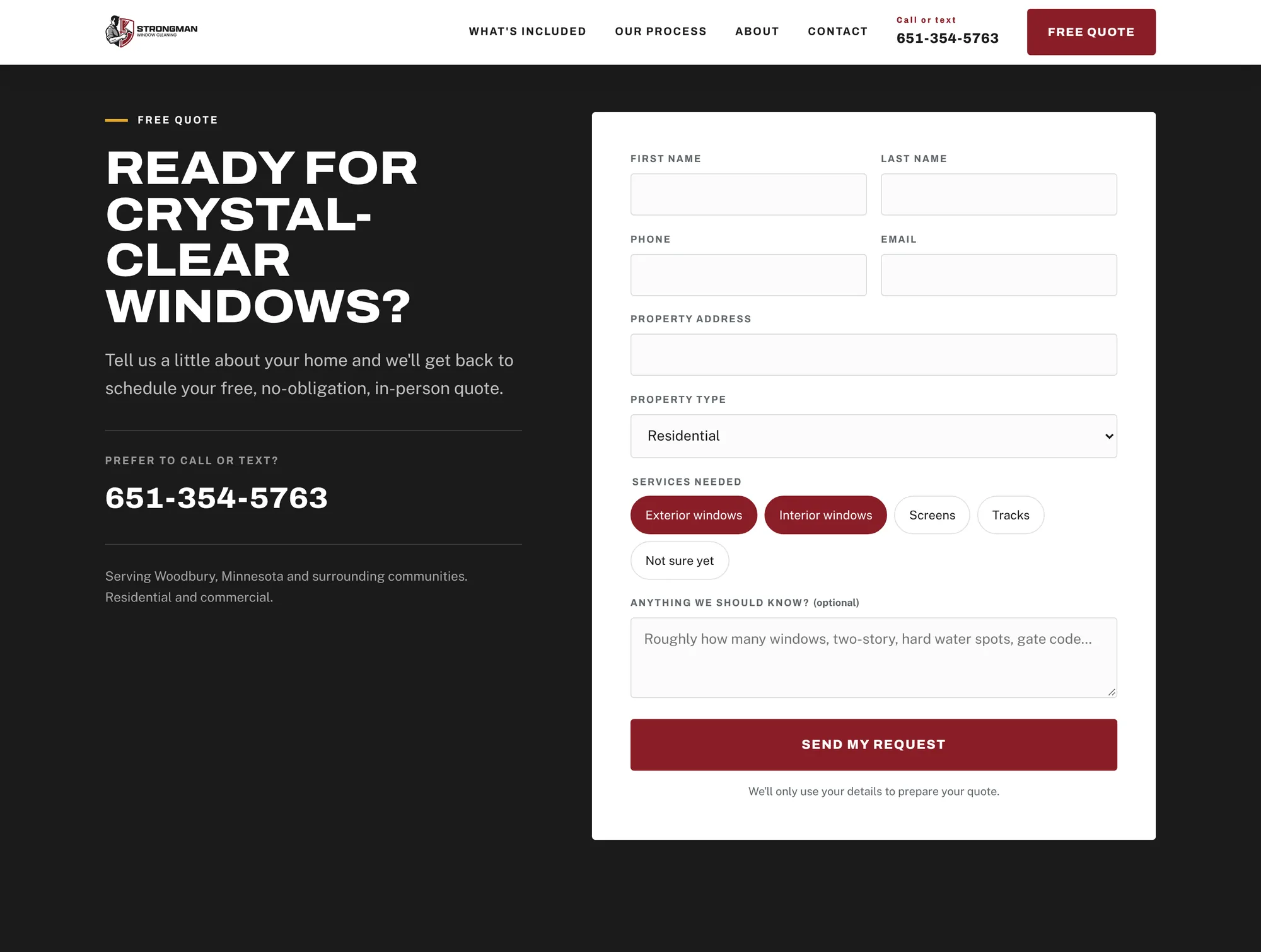
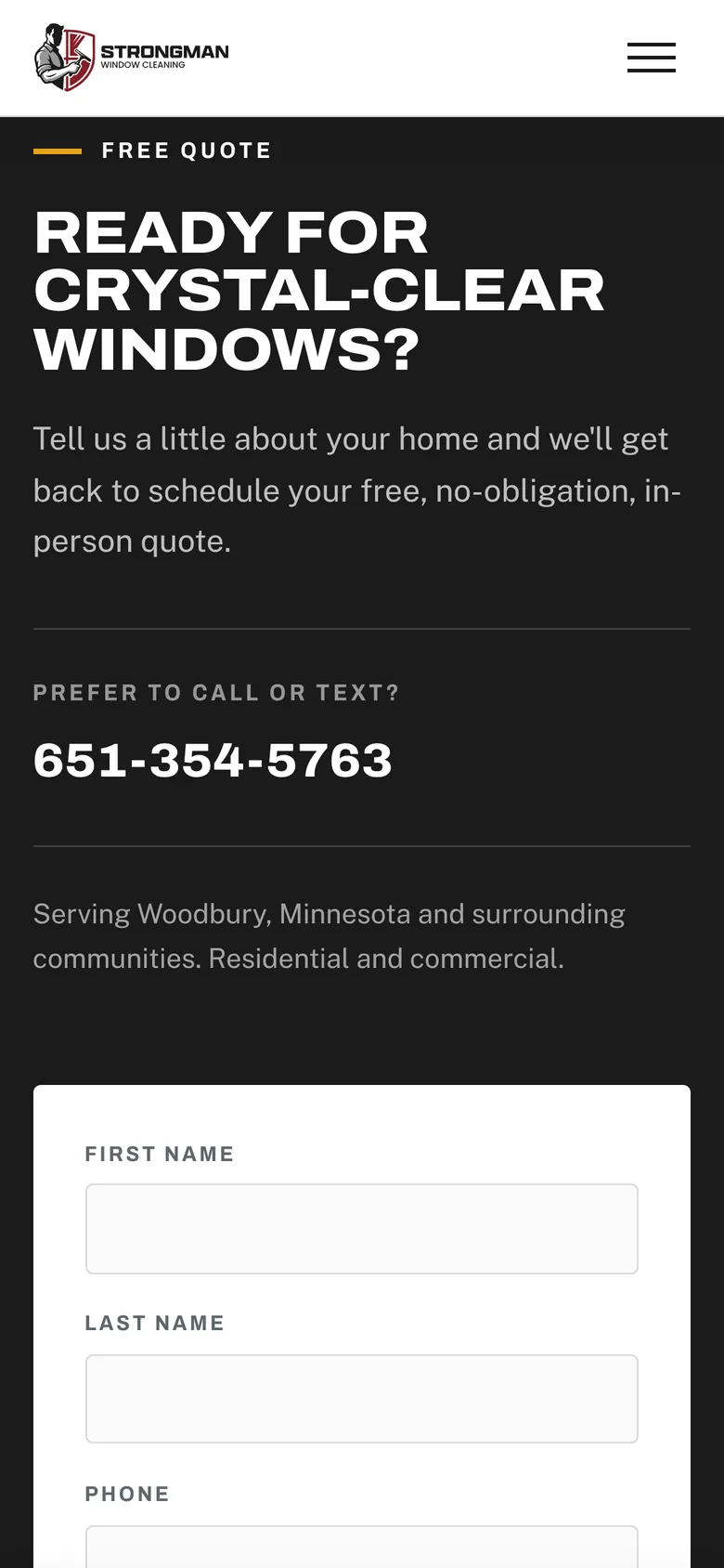
A short form with tap-to-select service chips, sent straight to the owner through Netlify Forms. Visitors who'd rather talk get the call-or-text number right beside it.
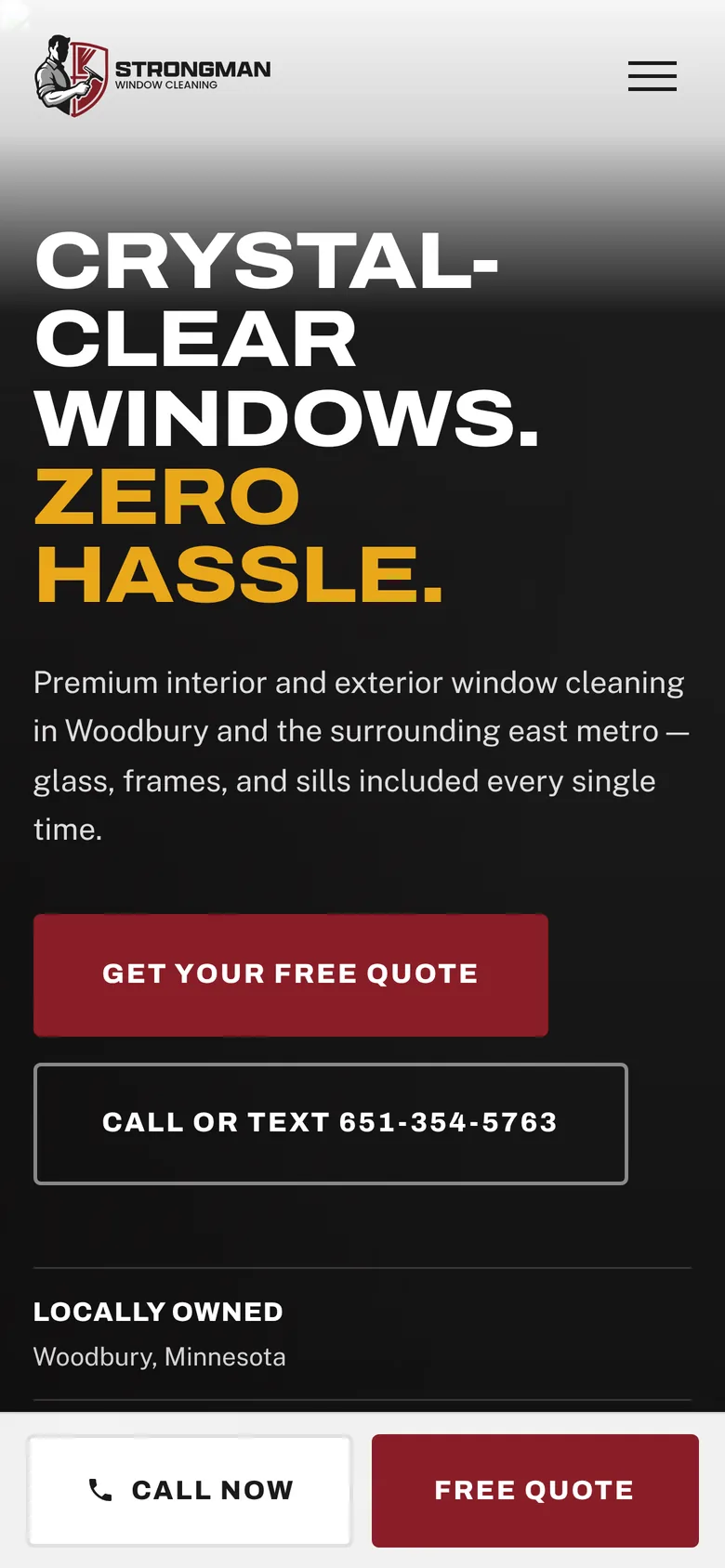
Most homeowners find a window cleaner on their phone. The layout stacks cleanly, the headline stays huge, and a sticky Call Now / Free Quote bar stays on screen the whole way down.
Crimson comes from the Strongman shield. Gold is for the punch lines. Cool glass greys keep it light, like a freshly cleaned window.
My capstone brand: a streetwear label built for the skate park and the cypher. A hard-edged E that doubles as a lightning bolt, a hand-drawn tag with real handstyle, and one loud green you can spot from across the lot.
"Create successful branding representing a lifestyle brand, a brand that stands behind true stories, cleaned up but feels urban."
18 to 35. Streetwear and hip-hop heads, and anyone into graffiti style or culture.
A mark the brand can rep for years, clothing designs, tags and an online shop.
#000000 / #FFFFFF / #39B339
New Hero Bold + New Hero Regular
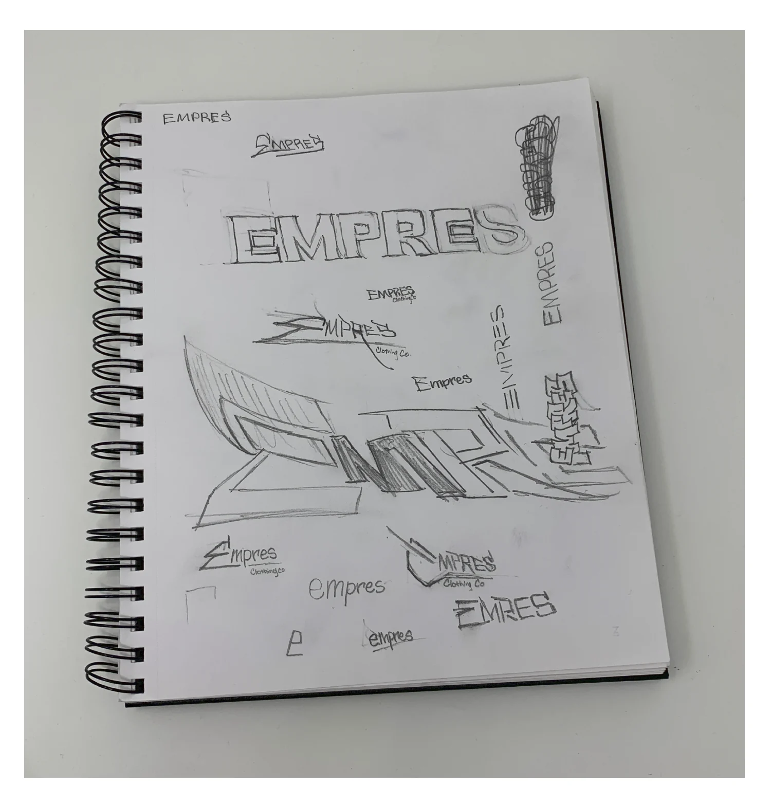
Block letters, extruded 3D type, script tags and a dozen small marks, all on one page. The zig-zag E came out of the block letters, and the tag came out of the script. Both made it into the final system.
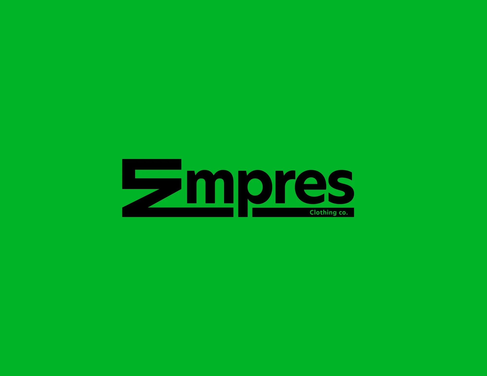
The E is cut from one zig-zag stroke, so it works on its own on a hang tag, a cap or a woven neck label. In the wordmark it leads straight into "mpres," and the bar underneath carries the Clothing co. line. Two colors, no gradients, nothing to lose in a screen print.
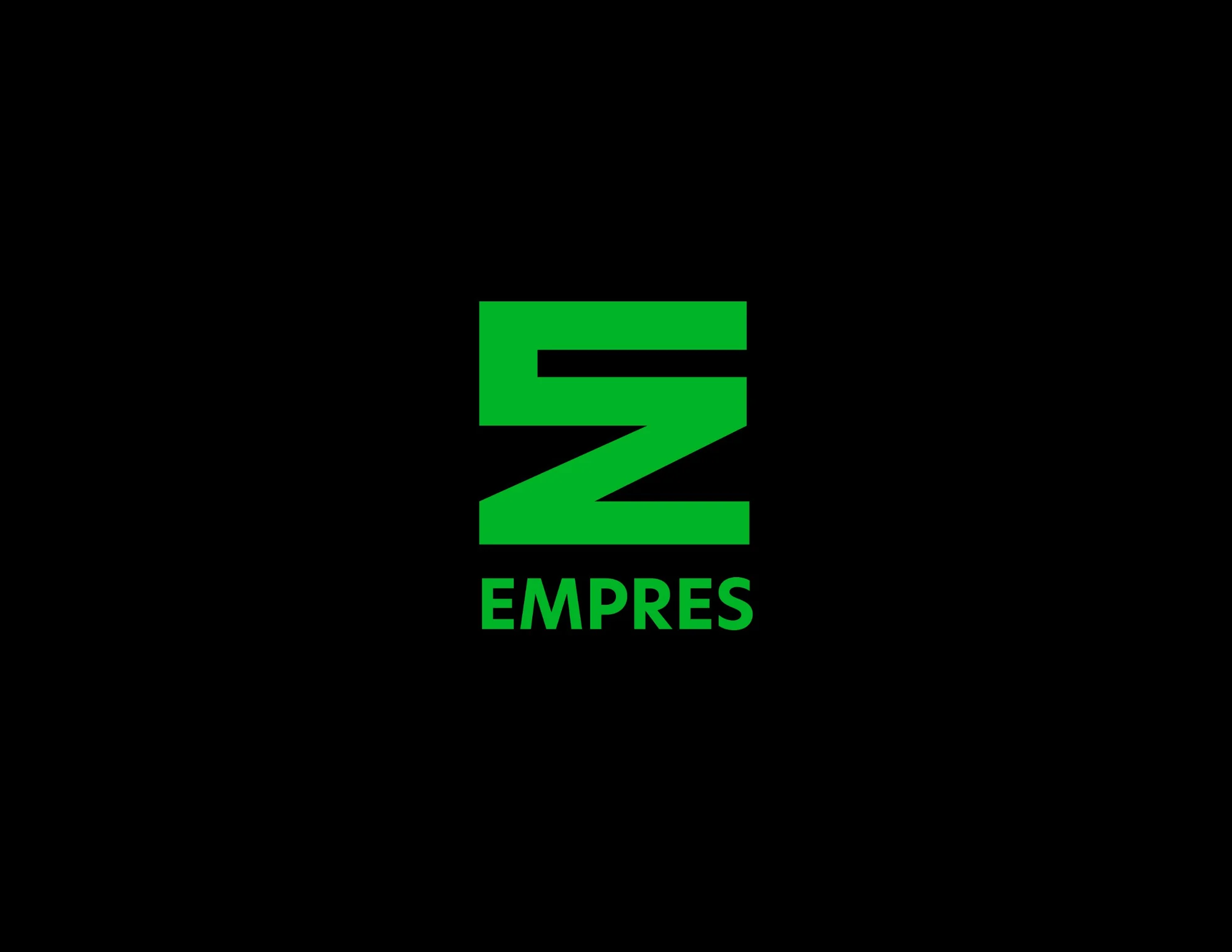
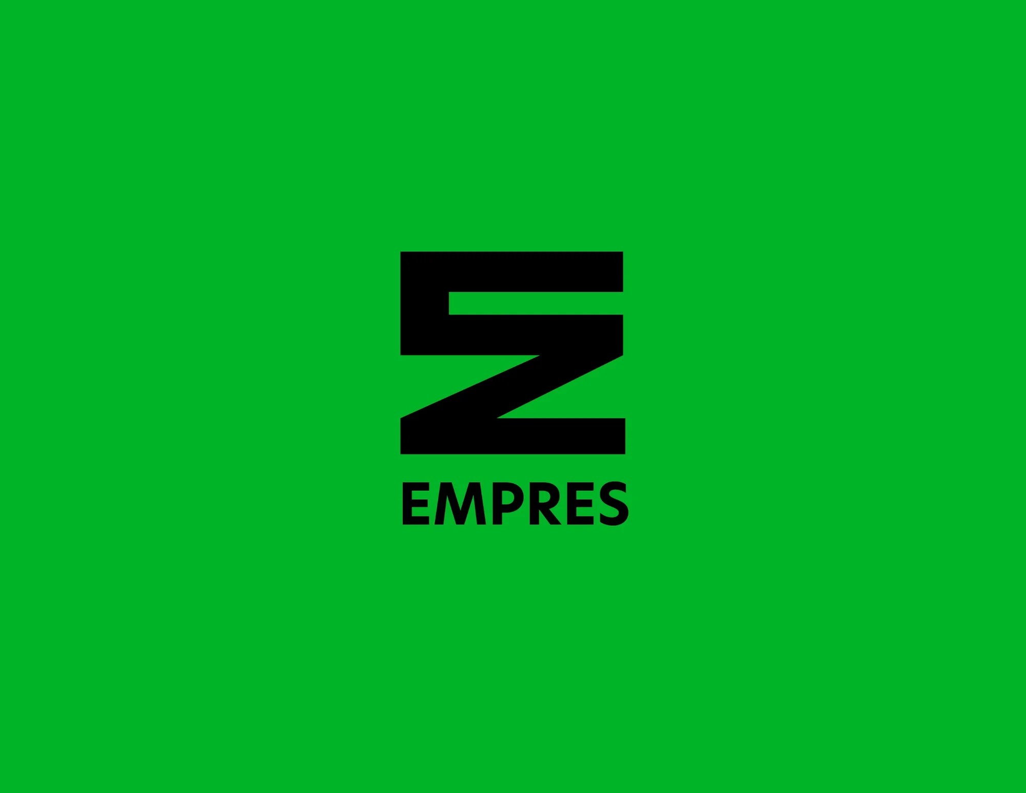
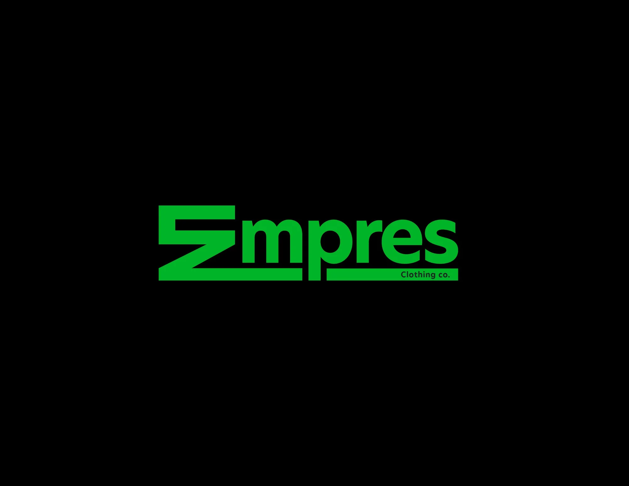
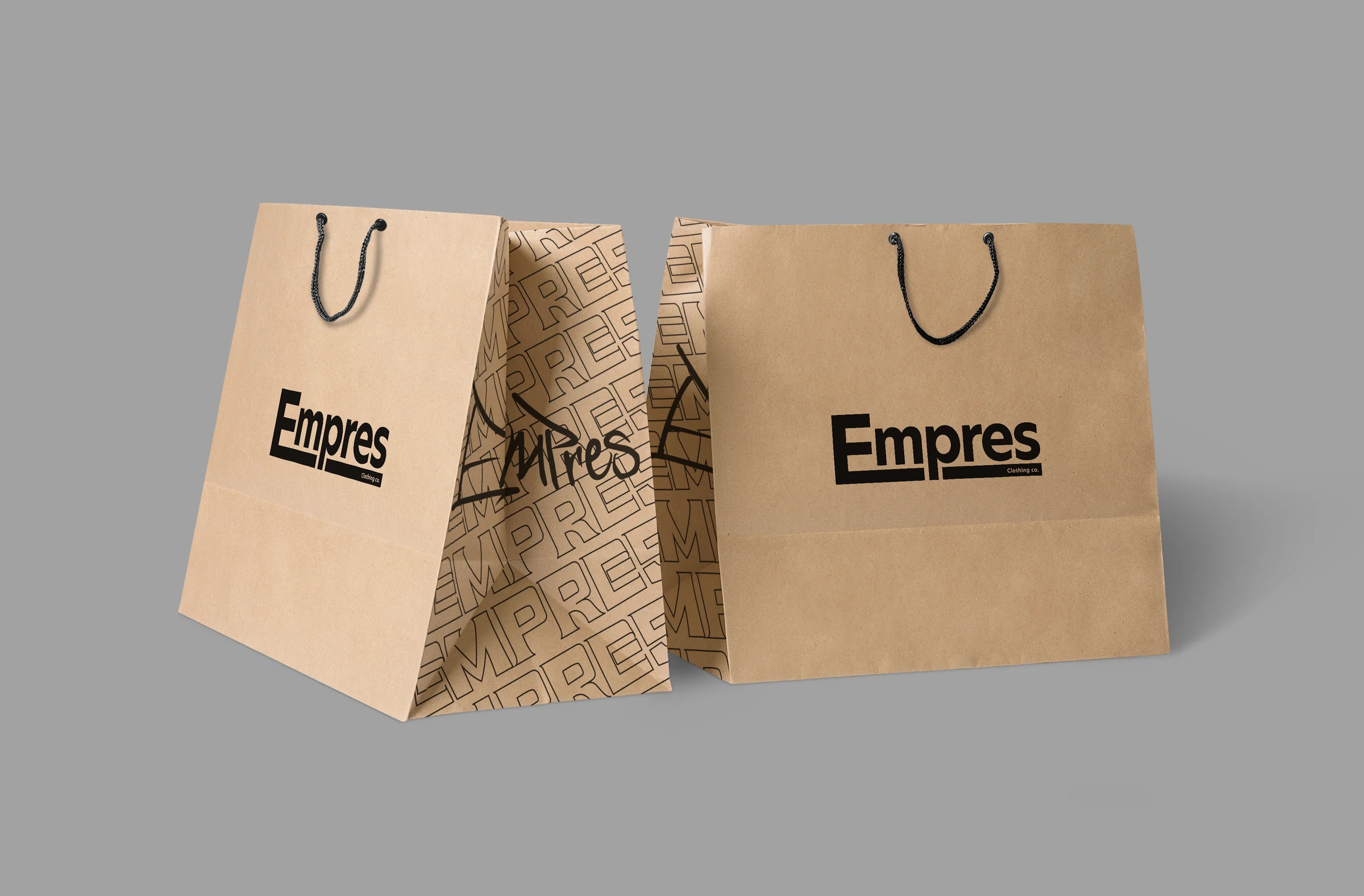
Drawn by hand, then kept rough on purpose. The tag is the brand's signature and the loosest thing in the system, so it sits next to the hard-edged mark without competing. It shows up where you least expect it, like the gusset of the shopping bag.

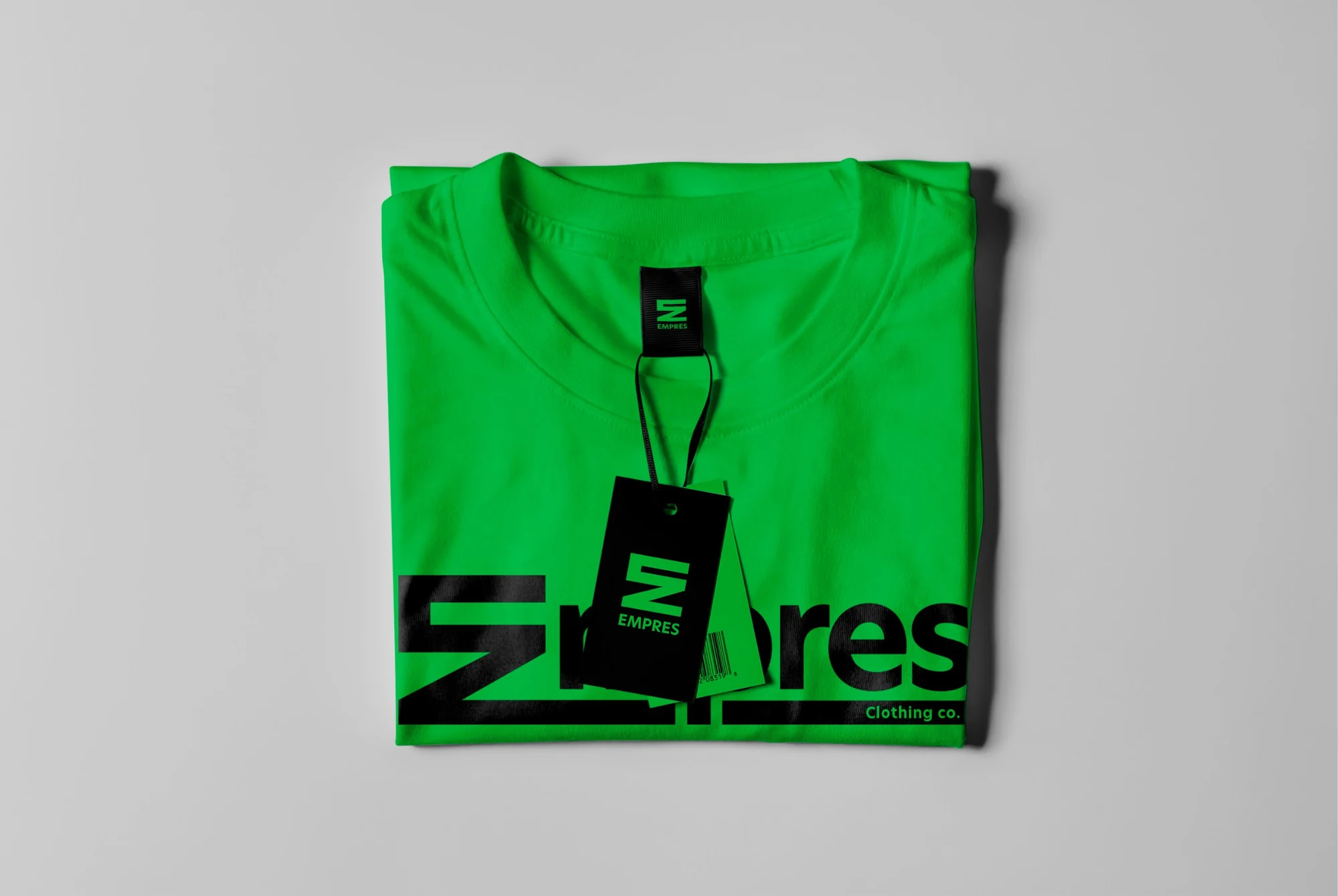
Two colorways, two print placements. A small chest hit for every day, a full-front wordmark for when you want the whole park to know. Build one below.

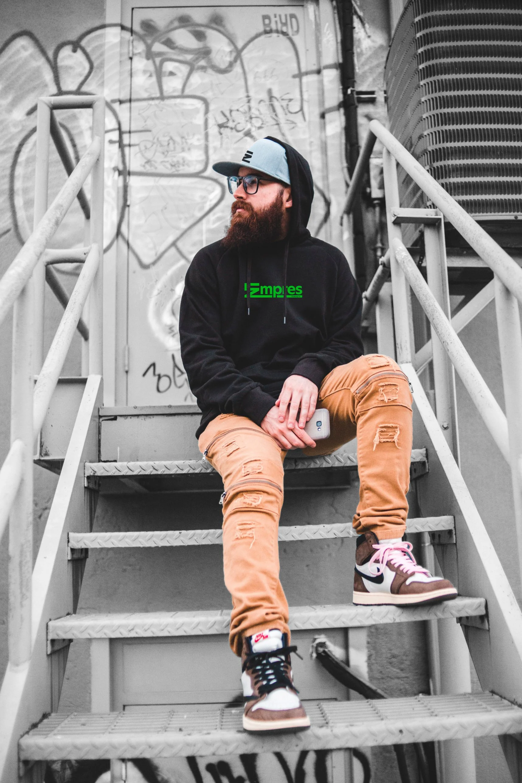
The campaign line turns the name into a verb. One-handed freeze by the river, branded cap and hoodie, headline split around the kick. Shot in black and white, then graded green so the whole frame wears the brand. Drag to see the grade.
 Raw
 Graded
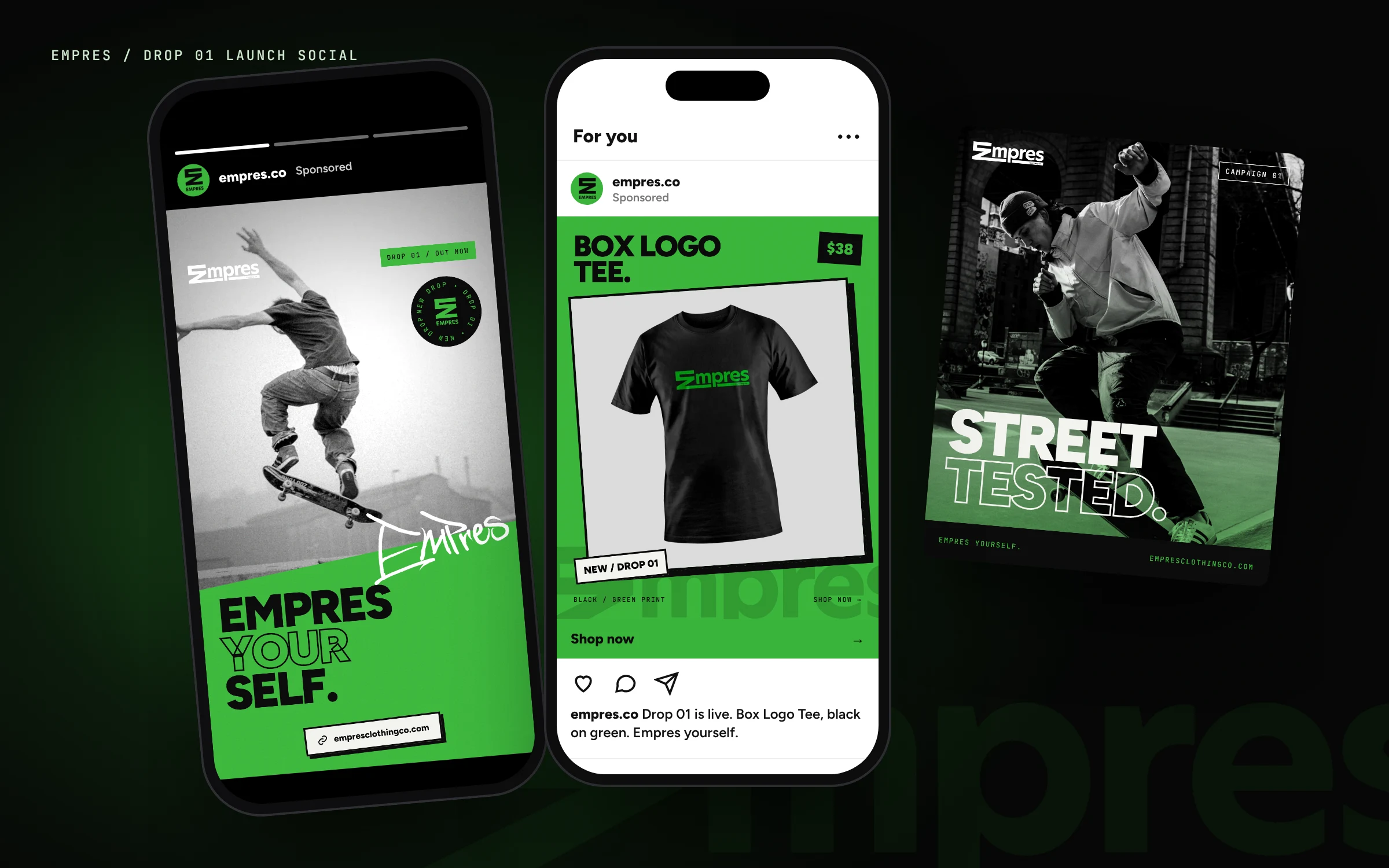
Launch kit for Drop 01, one story and two feed posts. Black-and-white skate photos, a hard green slab and the tag slapped across it, so the ad looks like it came from the same wall as the brand. One job each: get them to the site.
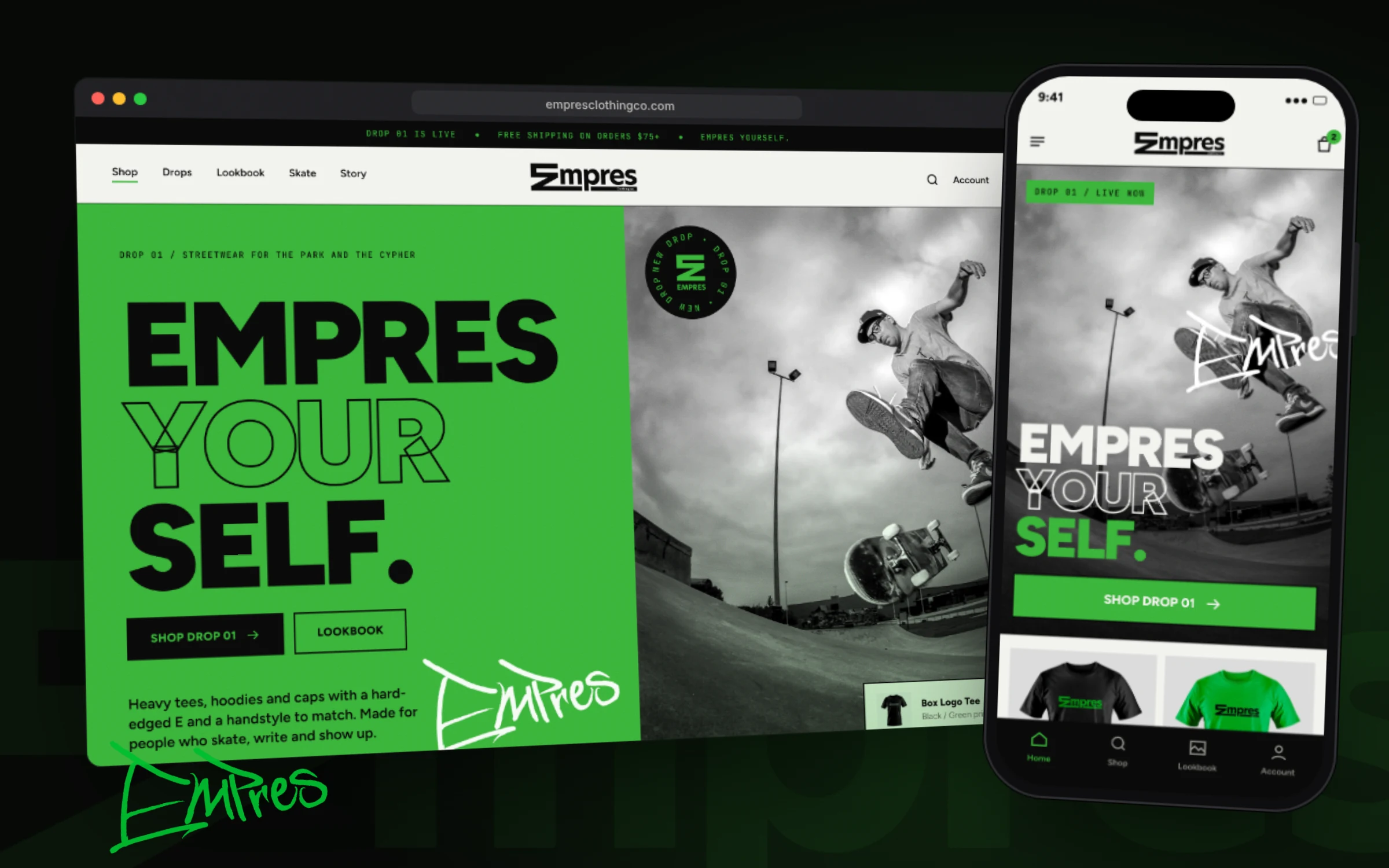
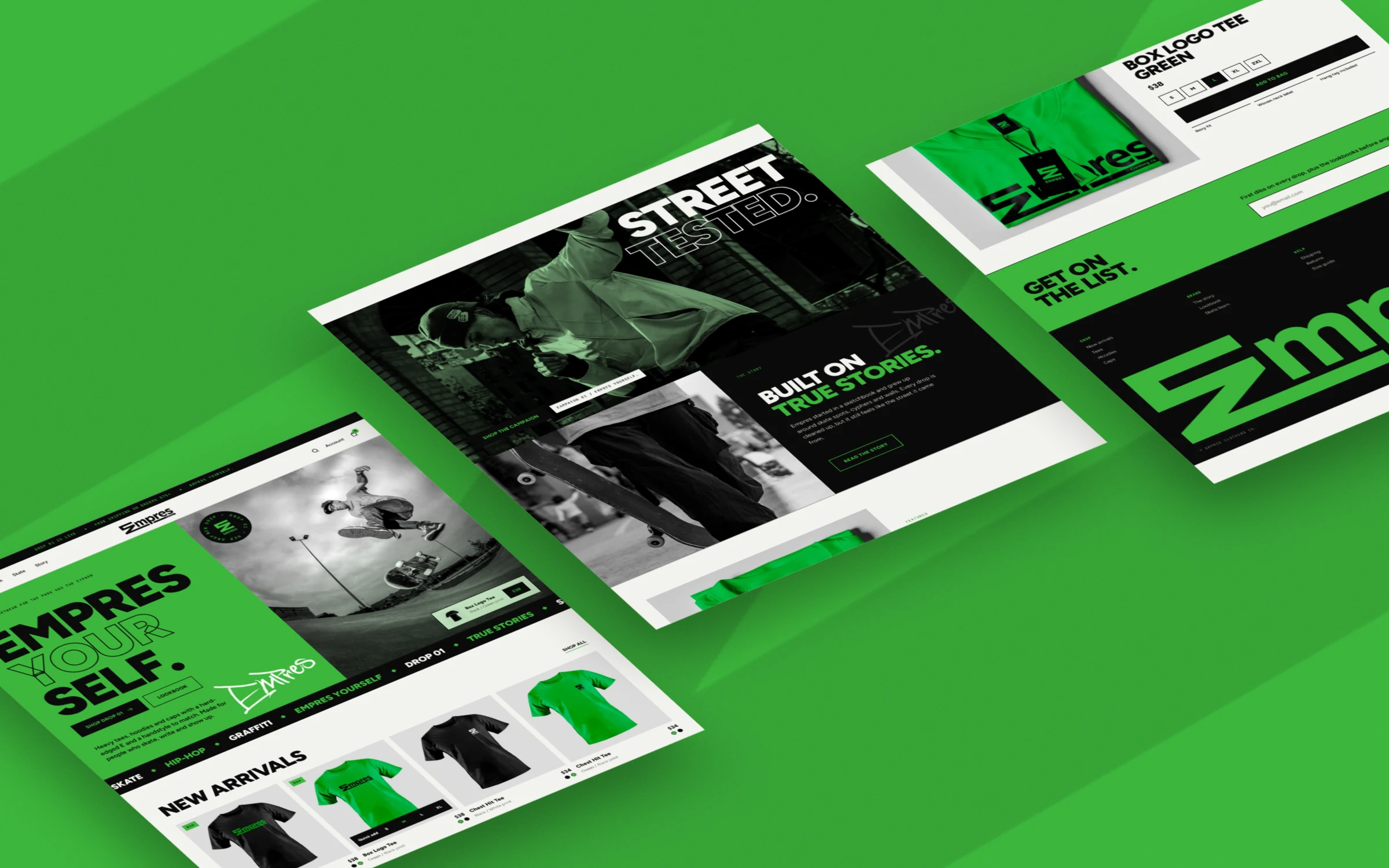
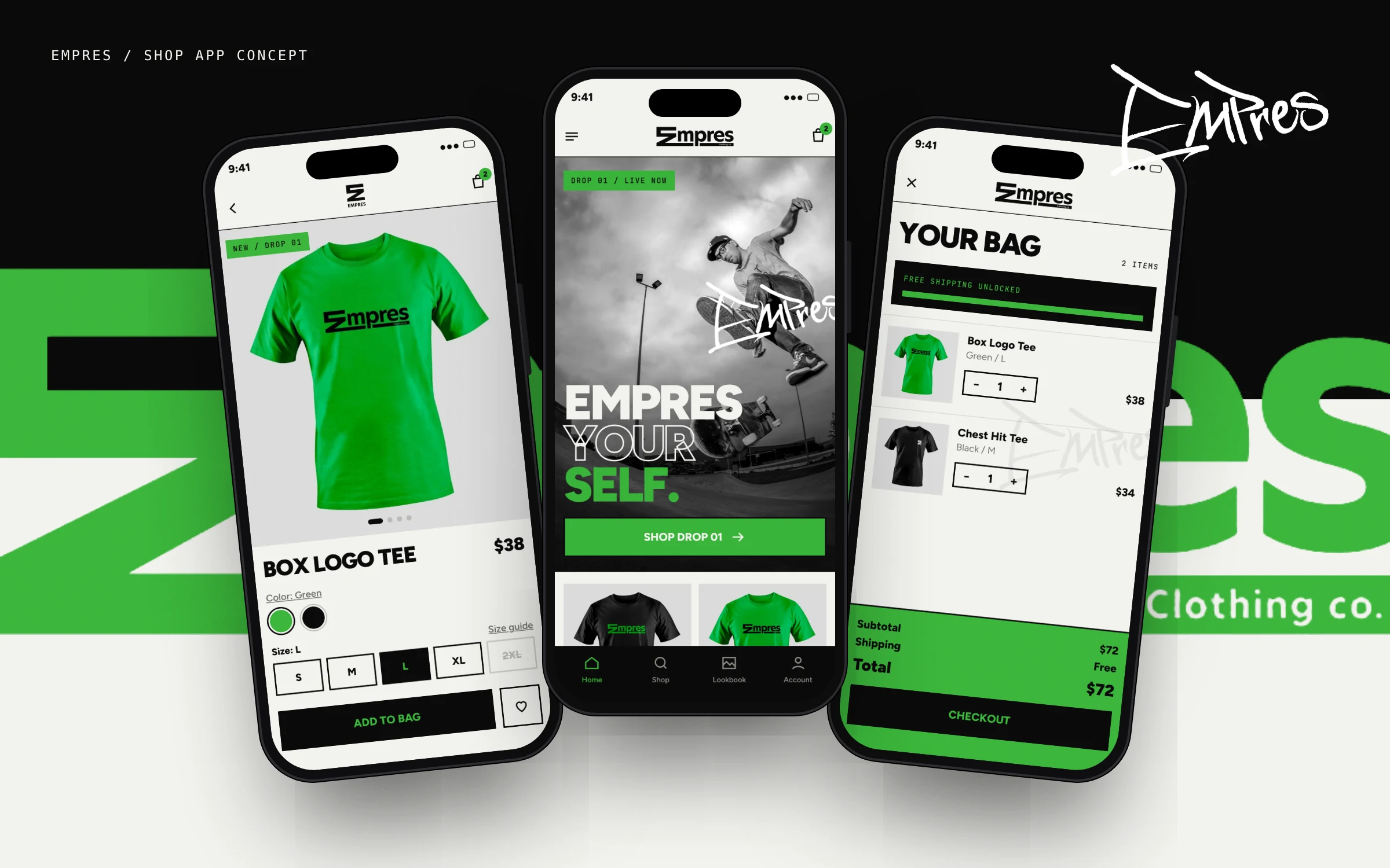
A full storefront and shop app to sell the drops. Black-and-white skate photography against the brand green, a headline that splits "your" into an outline, the hand-drawn tag slapped across the hero, and hard-edged product cards with quick add. On the phone the nav steps down to the stacked mark so it still hits.
Every skate brand lives on stickers. Tap the grip tape to slap one down, drag them around, and peel them off when you're done.


